Adobe Lightroom Classic develop module
About Lightroom develop module
Product: Adobe Lightroom Classic | Subject: Adobe Photoshop Lightroom Classic
In this exercise, we will learn about Adobe Lightroom Classic develop module.
Introducing The "Develop" Module
In this section, I want to spend a few minutes welcoming you to the develop module. Now the develop module is where I spend the bulk of my time, especially when I'm working with my photos because it's in the develop module that you can make all your adjustments, all your retouching, all your cropping, and all sorts of fun things that you do to your images to make your images, your images. That is to say; you're going to spend all of your time within the develop module to put your artistic touches, your creative touches, and all of your other signature items on to those images to make those images your own.
But for now, I want to point out just a couple of areas within the develop module that will help you make the best use of your workflow and help you adapt to the workflow that makes the most sense for you. Now, you'll notice that the develop module is similar to all of the other modules in that there's a top panel, a left panel, a bottom panel, and then there's the right panel.

The sections available in the left-hand panel are similar to what was available to you within the library module, with just a few additions. There is the navigator section that was the same in the library module. There's also the collections section that was also the same within the library module. The new sections are the presets, snapshots, and the history.

On the right-hand side, you'll notice that the sections are very specific to the work you're working on within the develop module.

Just to quickly recap, the left panel is mostly the same as it was in the library module with a few additional sections specific to the develop module. On the other hand, the right-hand panel is entirely a new set of pertinent and relevant sections to the work that you're going to be doing in the develop module.
One of the things that I like to do when I'm working in the develop module is to keep that navigator window open. I do this because the navigator shows the final effect of the changes that I make and the adjustments that I make within the develop module to my photo. Another section that I like to open on the left-hand side is the history section. This will show me the kind of changes that I've made to the image.

You will notice that in another section, we applied the auto-tone setting. If you hover over the first in the history settings, you'll notice the thumbnail view in the navigator section updates. This is what I mean when I talk about the thumbnail views because the navigator view will show you the most recent, most active, and most active history of this image. Now here is one of the benefits that I think makes Lightroom such a fantastic tool. That is because Lightroom is a non-destructive workflow. With all of these changes that I make to the images, all the adjustments that I apply to the images don't apply to the image until the final export process. This is why it's so handy to understand the history of the image so that we can go back and see the kind of changes that we've made to the image and readjust them or undo them completely so that we can have a view of that final product that has our unique creative stamp on it.
Another section that I like to keep open in my left-hand panel is the presets section. Now I'm going to open it up and show you what I have available. Now you're not going to have these specific presets because these are user-defined presets.

In my case, these are presets that I bought in a marketplace, such as graphic river. Now I'm going to scroll down to show you which presets you will have available. When you install Lightroom, you'll notice that some of the available presets are the Lightroom presets.

Some of them are black and white filter presets. Certain others are black and whites, colors, effects, and general presets that you can use. You can go ahead and open it up to see what I mean. Each of these presets has a certain effect so that when we hover over them, you will notice that the actual thumbnail image in the navigator view changes depending upon what kind of preset is going to be applied. So let's go ahead and apply the blue filter. You'll notice the image changes, but previously, the navigator view changed.

Once we scroll down to the history, we can see that the preset blue filter was applied. Now let's undo that by either hitting Ctrl + Z or scrolling down to the most recent change within the history panel. As you can see, the image itself was changed, and the navigator view was changed as well. Let me close the presets view to give it a little bit more room and just keep open the navigator and the History panel.
We have several different sections on the right-hand panel that we can open up or collapse as we need it. The first one is the histogram, and the histogram has a lot of information about the tonal values within the image; you can see that it's all bunched up.

You notice that the mouse turns into a double-sided arrow, which means that you can click on each of these areas and drag it left and right and make the appropriate adjustments. A couple more areas I want to point out are the clippings. The left one is for the shadows, and the right one is for the highlights.

The highlights will show up in red on the image, and the shadows are going to show up in dark blue on the image, as shown in the image below.

Below the histogram, you will find the tool strip.

The tool strip has several tools that you can use to make very specific localized adjustments to your image:
- Crop tool.
- Spot Removal Tool.
- Red-eye correction tool.
- Graduated filter.
- Original filter.
- Adjustment brush.
Below the tool strip is the basic corrections that you can make to your image. Let me open it up and show you what's available.

Within the basic section, there are several subsections, such as white balance, which is the tone where you're going to change exposure and contrast, adjust your highlights, and so on. The final subsection is the presence of sections where you can adjust clarity, improve your vibrance, and adjust your saturation.
Below the basic section is your tone curve section.

Now the tone curve, you can make adjustments to highlights, the lights, the darks, and then, of course, the shadows. Highlights and lights are similar darks and shadows are similar. You can also make adjustments to the point curve as well. Like the histogram, you'll notice that the cursor changes every time you hover upon any of these areas. So if you click and drag, you will make the adjustments. If you want to make finer adjustments, you can also use the sliders or enter the specific values you want.
The next section has to do with fine-tuning your color space. So let's open it up and show you what's available. You have hue saturation and luminance type of adjustments that you can make to all of your channels.

You also have color adjustments that you can make to all of these channels.

Then also, you can fine tune your black and whites based upon these channels.

This is a lot of very fine tuning of color adjustments.
Next is the Split Toning, where you can make different kinds of color adjustments if you're working with monochrome colors or working with different colors.

Below Split Toning is the detail section. Let's open it up and show you what's available. Within the details section, you'll notice two subsections. The first one is sharpening, and the second one is noise reduction.

This is just a little bit more fine tuning of the details, the noise reduction, and the sharpening of your images when working with all of these adjustments.
The next section is the lens correction. In this section, you can adjust for the chromatic aberrations found within the lenses or even some sort of lens vignetting specific to that type of lens you've used with your photography. If you have many lenses or working with new lenses or something like that, certain lenses have certain properties on certain bodies that you might want to adjust for those kinds of inconsistencies. That's what you can do with the lens correction.

The next section is for effects. Let's open it up and show you what's available. Now here you can do your vignetting. This is post-crop vignetting. So after you've used the crop adjustment tool and made your final crop, the vignette will be applied to that section within the crop. That's important. The other thing you can add is also grain and the texture you want to give to the image. Finally, you can also Dehaze or add more fog or less fog, depending upon the artistic affects you want to apply to your image.

The last section is to deal with camera calibration.

In many ways, it's similar to the lens correction profiles. But this is specific to your camera body. So over time, certain cameras will tend towards shift or some sort of processing that they do when they're working with their role engines or even their JPEGs. You can make very precise adjustments to know the kind of look that you're getting out of that kind of camera for those kinds of profiles. And all of this information is stored within the Exif metadata within other metadata of that image when the camera takes those photos. So that's it to the develop module.
You'll notice that there is a lot of work that we can do, especially with our images. One of the things that I appreciate in Photoshop Lightroom is that each section is organized to work top-down. So the most important thing to work with is the histogram, then you're going to make some crop adjustments and do some spot touching of the photos. Then you're going to make certain kinds of other adjustments. One thing to note is that all of these things work together to create the final image. So you cannot adjust each one of these independently. So as you get better and better with your retouching with your processing with your workflow, you will find that you will reach into more and more different sections. As you improve as a photographer, you improve your workflow, as you generally improve or want to have certain kinds of creative looks. So out of all of these panels, the ones that I keep open the most are the histogram, the basic, and of course, the tone curve. As you work with Photoshop Lightroom as you work with your workflow and work with your creative process, you will find that certain sections become more important to you, and certain sections become less important to you. The invitation here is to work with your photos, get yourself a lot of experience, retouching working with images, and understand how your eye perceives the totally subjective interpretation of what these images evoke in you.
I hope this has helped give you a quick idea and welcome you to the develop section. Once again, if you do have any questions, please don't hesitate to reach out. I am here as a source of support for your continued learning.
Adjusting White Balance - Temperature & Tint
In this section, I want to talk to you about white balance or color temperature. So, in digital photography, white balance and color temperature are terms that are used interchangeably. So, when we work with white balance, and when we adjust the white balance, what we're trying to do is we're trying to ensure that the image that we see in our image editor, in this case of Adobe Photoshop Lightroom, we are trying to replicate and reproduce the lighting conditions under which the photo was taken. So as an example, I want to show you the image of the individual below.

Now it is obvious that the photo was taken indoors, you can see a bit of a background of the office, there are some fluorescent lights. Another very obvious thing is that fluorescent lighting gives a certain kind of color temperature. It gives off a certain light. It gives off a certain cast. You can very easily see it in the photo. It's kind of a greenish-yellow thing. That's why you know that the photo was taken indoors. When we adjust the white balance, what we're trying to do is we're trying to ensure that this final image in the digital workflow was accurately representative of the kind of lighting conditions that we had when we took the photo. Now it's at this point that I want to interject and mentioned that imagery/photography causes us to experience an emotion. So sometimes, it may not be valid to have an accurate portrayal of the lighting conditions. That is to say, you probably want, under certain conditions, maybe artistic conditions, or something that the client wants from you. Under those conditions, you want to adjust the white balance so that it creates and evokes a certain kind of emotion in the viewer. But for this example, and working with the above image, what we want to do is we want to accurately portray something for a yearbook or for an online publication, or something like that, that ensures that the image is clear that it's crisp, and that it's quite accurate in terms of color reproduction. So what we're going to do now is we're going to go into the develop module, and we're going to open up the basic section, the basic adjustments section.

Now that we are here, we can see that there are just a couple of things under this white balance subsection. There is a temperature slider that goes left and right, and then there's also a tint slider that goes left to right. Additionally, we have the eyedropper, which is the white-bound selector tool. Then we kind of have the drop-down menu of white balance. Right away, that tells us that we have more than one way of adjusting the white balance. So first of all, let me talk to you about the drop-down menu.
When you click on the drop-down menu, there are three different options:
- There is the As shot option. This is the default view of the white balance. If your camera has a certain white balance setting, it has a tungsten setting or a shade setting or daylight or sunny, that is the As shot settings that Adobe Photoshop Lightroom will use, and it will display on the screen for you.
- When you select the auto option, what you're telling Lightroom to do is, based upon the image data, go ahead and make those calculations for white balance and color temperature for me and I'll be happy with that. If I select to do the auto white balance for our first photo of the gentleman with a beard, you will notice the changes.
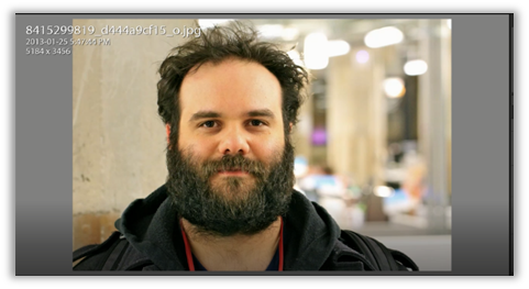

You can see that Lightroom has done a pretty good job in the second photo of finding out what the white balance is. You should notice that most of that fluorescent cast has gone. And there's a little bit more detail in the fellow's beard.
- The third option for the white balance is the custom. This changes automatically when you adjust the sliders or make use of the white balance selector tool and make that adjustment.
So what I'm going to do now is choose the white balance tool, and I'm just going to hover over the various areas of the image. I'm going to pick a target neutral. The idea behind the target neutral is, it should be what we call neutral gray. So the area that best represents a neutral gray and the neutral gray should look like the sides of the image. Now, if your image doesn't have a neutral gray area, what you should do is then pick a target neutral area, make sure you don't pick anything that is bright white, because if you do, Lightroom is going to say ‘cannot set the white balance, please click on a darker neutral area.’

Well, there are a whole bunch of areas that we can use as our neutral gray. One thing you to take a look at is the navigator section. As we hover with our white balance selector tool, you will notice that the navigator section updates real-time to show us what the image will look like. If we choose a particular area as our target neutral, the image will adjust itself accordingly. The History panel will show that it is now a custom white balance. Now, any other adjustments you want to make in the white balance can fine-tune it using the sliders. Or, of course, you can use the white balance selector tool and choose a different target area.
As a second example, I'm choosing the image of this flower, because very specifically, it's a raw file.

When you choose a raw file and work with the white balance settings, Adobe Photoshop Lightroom is just going to give you a few more options outside of the auto and the custom settings. So I'll show you what I mean. Now, I'm going to the right click panel, and you can see that there are auto and custom, but we also have a few more white balance settings that we can work with.

Now we can choose any one of these white balance settings. But for now, I'm going to choose the auto setting. I'm doing this because I want to show you that while Lightroom is really good for most photos, sometimes it just doesn't do the auto setting well. So I'm going to go ahead and click, and before I click, I want you to keep an eye out on the middle section here to see how the image changes. But let's go ahead and click that.

You'll notice what Adobe Photoshop Lightroom did was it cooled down the image by quite a bit. It dropped the color temperature out, and it made it way cooler than it should have been. So, in this case, the auto is not a good choice. We want to work with the temperature sliders. We want to adjust the temperature; maybe we want to shift the tint to the right and make sure that the image pops out at us.
To quickly recap, In this section, we went through the basic section in the develop module. We worked on adjusting the white balance. We learned that we could change certain profiles as long as it was a raw image. Or we could work with the auto selection that Photoshop Lightroom can give to us. If we wanted to make any other fine-tuned adjustments, we could adjust the sliders for temperature and tint. If we adjust to the left on the temperature slider, we make the image cooler. That is, we move it toward blue. And if we move it toward the right, we make it a lot warmer, and we move it toward the darker ready orange color.
Additionally, there is the tint. If we move the tint to the left, we will add a green tint to the image. If we move it to the right, we will add a stronger magenta tint to the image. Finally, we learned that working with color temperature or white balance accurately represents the lighting environment under which the photo was taken. If you have any questions about white balance or these kinds of particular develop settings, please don't hesitate to reach out. I am here as a source for your continued learning.
Full Course and Free Book
-

Adobe Photoshop Lightroom Classic
Course5.0 average rating (1 review)Are you a professional an amateur or an aspiring photographer or a digital artist? Impress by creating breathtaking photos with Photoshop Lightroom Classic CC. Learn hands-on techniques from one of the best photo editors there is.
Purchase$1 / month
-

Adobe Photoshop Lightroom Classic Book
CourseAre you a professional an amateur or an aspiring photographer or a digital artist? Impress by creating breathtaking photos with Photoshop Lightroom Classic CC. Learn hands-on techniques from one of the best photo editors there is.
Free