Adobe Lightroom Classic HSL (Hue, Saturation, Luminance).
About Lightroom HSL (Hue, Saturation, Luminance).
Product: Adobe Lightroom Classic | Subject: Adobe Photoshop Lightroom Classic
In this exercise, we will learn about Adobe Lightroom Classic Understanding HSL (Hue, Saturation, Luminance).
In this section, I want to share a couple of techniques that you can use to adjust the color ranges very precisely, very individually in your photos. For this example, I have created this collection of photos to explain what you can do.

In this quick collection, there are seven images. The first one is the color wheel. So let's go ahead into the develop module to show you what that looks like. Now, this is a color wheel.

This is something that I wanted to show you so that you have a better idea of what exactly you are adjusting when you use the HSL, color, and B&W panel on the right. Let me go ahead and open it up. When I do, you'll notice that a whole bunch of sliders open up. The sliders are for hue, saturation, and luminance.

You will notice that we are adjusting individual ranges of color from red down to magenta for each hue, saturation, and luminance. Essentially with these sliders, we are precisely fine-tuning each of the colors within our images to have that kind of impact and that final look at the images that we want.
Let me show you a couple of photos that I have already made the adjustments to.

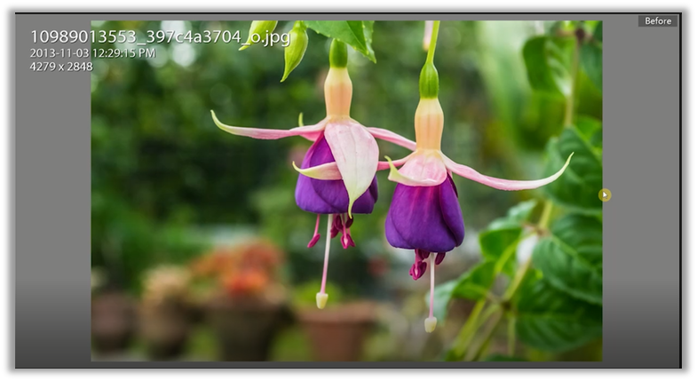
If you look at this photo here, you will notice that I've made several adjustments to orange luminance, green, luminance, and so on within the History panel. Let's look at the before and the after photo for this. Now, this is the after image.

And this is the before image.

You will notice I have slightly reduced the luminance of the background, I have increased the luminance of the orange, and I've made this stand out just a little bit more. You will notice that the flowers become the focal point of this image. To me, it's just a little bit richer and a little bit more enjoyable to view.
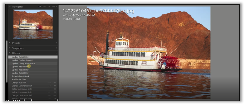
Another example that I have for you is this photo of this riverboat.

I have added some radial filters and added a little clarity and other adjustments to pop out this image. Let me show you the before and the after. This is the before look. You can see it's kind of washed out here.

And this is the after.

Now the effect down is due to that Radial Filter where I increased the exposure. But you can see very easily that I have changed the look of the mountains' water and gave it just a little more oomph and a little more excitement in the image. The kind of emotion that I create for the viewer is something that I can consciously create. Then finally, let me show you one final adjustment that I made using the HSL sliders. This is the after view of the photo.

And this is the before view.

Once again, you will notice that it's a very subtle shift. You can see the speedometer has changed into more green color. That makes it stand out a little bit more.
So getting back to what color is about. Let me bring out the color wheel, and I'm going to talk about hue, saturation, and luminance. Let's work with saturation first because I think it's probably the easiest to understand. When we reduce the saturation, we are desaturating the image for each of these color bands. When we reduce it all, it becomes monochromatic. It becomes grayscale.

So that's essentially what the saturation does. But what I want to do now is reset all of these sliders. So, I'm going to hold down the Alt key, and when I do, it says reset saturation. So, I will click on it, and all the sliders go back to zero. Now I'm going to push all of the saturation sliders to the other side. You will notice the vividness of the colors as they jump out. Now, this is the after view.

This is the before view here.

You can see that the vividness has changed a bit, and it's a much more dramatic shift in terms of vividness. Once again, I'm going to go ahead and reset the saturation. So that's what saturation is. It just shows just how much vividness each of these color bands is going to have.
Next, let's talk about luminance. Luminance is about the brightness of those color bands in general. As I increase the luminance and you'll notice the color bands are getting noticeably brighter and are going to shift Much, much more and become that much brighter to the final look of the image. You'll notice how the image keeps changing in terms of the brightness of the color wheel. Now, this is the after view.

And this is the before view.

Since I have adjusted the luminance to all the color bands, you'll notice it's a very dramatic effect.
Once again, I'm going to reset it and show you now what hue does. Now hue is a very interesting adjustment. Each of these colors has neighboring colors. For example, red is neighboring magenta on the left and orange on the right side. So when I adjust the red band slider to the left, what I am saying is to shift your colors to match your neighbor on the left. In this case, the neighbor is going to be magenta. So let me undo that and show you what I mean.

Keep an eye out here on the red band as I move the slider to the left. You will notice it becoming more and more similar to the colors to the left.

You can see a very subtle shift. If I undo that and adjust it to the right, you'll notice the red band move slightly into the orange band. When you adjust these hue sliders, you are not telling red to go entirely orange. You're saying that the reds that I see on this image, I want them more to look like the orange or more to look like the magenta. They're not going to be orange or magenta in this case. So one way to adjust all of these color bands is to go to each hue, saturation, and luminance. You will notice that the color bands are the same. If you want to see all of them at once, you click on all, and you will have hue saturation and luminance, or each of the color bands in one panel. This is quite a lot, and this is not something that I work on. What if you wanted to work on one color band in particular and adjust Hue Saturation luminance all at once? That's where you go into the color area.

If you click on it, you'll notice that up here. You can choose which of the bands you want to work with. You will notice the highlighted one will have the hue saturation and luminance adjustments you can work with. But you can work with each band individually and very specifically and adjust HSL values to suit the kind of look you're going for. If you go to all, it becomes all like this, and every single color band has its HSL values individually.

Now once again, this can be a bit too much. So I invite you to play around with it and work with these adjustments the way you want to work. I hope this section has helped you understand what hue saturation and luminance are.
HSL Examples
In this section, I will work with just a few images to show you what you can do with the HSL sliders in the develop module. This is precise adjustments and tuning of each of the particular color bands in your image. So once again, we are going to work with this select set of images. We're going to work with this image of the flowers, the riverboat, and then this Speedometer as well.
Let's go back to the flowers. You will notice within the History panel; I have already made certain adjustments that I thought were appropriate.

This is an entirely subjective process, and it depends on what you want and what your client wants, and what other stakeholders have in this image. So you will work with the people and adhere to their requirements and create an image that makes sense to you, which makes sense to them and works within the requirements.
So let me go back to the imported photo. I'm going to right click on the image itself and choose to reset it to get rid of all of the adjustments that I made. Now I am in the develop module, and I've opened up the HSL settings under hue.

I'm trying to make adjustments to each of the colors that I want to stand out. The best thing to do for me right now is to go into luminance and ensure that I take the background down because I want to make sure that everything in the front pops out. So in the background, it's mostly green. So I'm going to adjust the green channel and bring the luminance down so that the front is more illuminated and has a bit more vibrance. I can also move the oranges up a little. I can move the yellows up and adjust the purples to make them pop out more. And then the Reds as well.
Another way to make these adjustments is to click on the icon below instead of using the sliders.
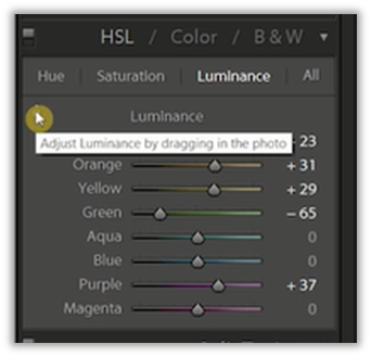
It will tell you that you can adjust luminance by dragging in the photo. So I'm going to click on it and move to the photo. You will notice that my cursor changes to a crosshair with a small icon that indicates up and down. If I click on the green area, you'll notice that the green band is highlighted on the panel. If I move up, I'm going to increase the greens' luminance, and if I scroll down, I'm going to reduce the luminance of the greens. Depending on where I go in the photos, I'm going to make these very fine adjustments to certain sections of the image. Now I will go to the saturation and show you what I mean. So this is very, very easy to do. We adjust the kind of saturation that we want within these color bands. We can have a great idea of what the image is going to be. Then what it will do is it will adjust maybe one or two sliders as appropriately as it thinks it should.
Finally, let's go into the hue and see what we can do here. Now there is a lot of red here and a lot of purples. Let's see what I can do with adjusting the reds. Maybe I want to blend it in. So I'm just going to adjust the slider slightly so that it kind of blends in. Since I want more of a yellow look, let me adjust that and make sure that it moves into that space. Now I will go to the background. Let adjust the reds and the oranges in the background to make a slight shift in color to stand out. This was the image before the adjustments.
And this was the image after the adjustments.

To me, the images are quite different, and they create and evoke a different mood.
As a second example, I want to show you this riverboat here.
You will notice that I have made all of these adjustments seen in the history panel. I have also used a Radial Filter to show you how each of these adjustments can work well together to create a look that you want to go for. So I'm going to scroll down on the History panel, go to the import, then right click choose to reset all of the settings. This is the photo as it was originally shot.

Now I'm going to increase the color bands' luminance to give you an idea of how things will look in the background. I noticed that this is a nice rusty red, but maybe I want to drop it down because I want to focus on the riverboat. Now I'm in the saturation tab, and I want the Reds of this paddlewheel to show up a lot more. I want to bring the red color touching the water up slightly and make these slight adjustments to show much better. I think that's good. I will leave most of the other colors alone because they don't show up in the image. Then in terms of hue, I don't think I need to adjust them too much. Maybe we can drop the oranges, make them a little bit redder, give it a nice look, maybe very inviting, very warm. Now you will notice that the photo is okay.
But I think it could do with a little bit more adjustments. So I'm just going to close this HSL adjustment, and I'm going to go into the tool strip. I'm going to choose the Radial Filter and create a mask. This mask is going to be quite large. I'm going to make sure that it is adjusted and goes outside of the image itself. Now, I can select the overlay to show you what the mask is going to affect.

You can see it affects everything else, except for the area within the mask. So I'm going to choose to invert the mask because I want the area within the riverboat to be affected only. The effect that I want to apply is the exposure effect. If I choose one of these effects, it will reset all the sliders and only work with the appropriate sliders. So right now, I want to work with exposure. As we adjust the exposure, keep your eye on this navigator pane to give you an idea of what's happening. Remember to turn it off the overlay to see the effect.

You will notice that this area has been brightened up considerably compared to the background. So maybe that might be too much. So let me hover over the boat and squish the mask down to make sure that it is a much tighter effect and make sure that the feather becomes smoother and softer. This is what the image looks like after my adjustments.

And this is what it looks like before my adjustments.

So you can see from the before it was kind of dark, there was no attention. In the after view, it is quite nice. The attention is mostly on this riverboat, we're not focusing on the background, and it just gives a little bit more oomph and character to this image. For this example, I used the Radial Filter in combination with the HSL adjustments to give this photo to give this image a little more character and a little more excitement than I thought it previously had.
As a third example, I want to show you the adjustments that I made to this image of the speedometer.

From the History panel, you can see that I only made very slight adjustments. That's because I wanted to give a nice subtle look to this image. I'm just going to go ahead and reset this image just to show you what it looks like beforehand.

Now I want to work on the luminance of this image quickly. I'm going to choose the little target so that I can selectively adjust areas in my image. And depending on where I choose, you'll notice that sometimes it may not be quite the effect that I want. I want to maintain the sheet's true blues and bring the gray up to give it a little bit more of a hard edge. Let me adjust the saturation. In this case, let me bring up the saturation for the blue color. Then, of course, I'm going to adjust the hue. I'm going to make sure that the green goes into the little bit of the Aqua side. It's a little bit more fun. I'm going to see if I can bring a little more color down to this area by adjusting the orange.
Let's increase the saturation; just make that a nice contrast to this image. In this image, there aren't too many different color bands to adjust. So that is why some of the changes are very subtle.

I hope this has helped you work with the HSL sliders, work with hue, saturation, and luminance to create a nice effect. You are not just limited to all the adjustments within the HSL panel. You can use all of the other adjustments from each of the different sections to create that image to create that final look you want for your image or even your client wants. I hope this has been helpful. If you have any questions about how you can work with the HSL and color panels to make those adjustments to your color bands, please don't hesitate to reach out.
Full Course and Free Book
-

Adobe Photoshop Lightroom Classic
Course5.0 average rating (1 review)Are you a professional an amateur or an aspiring photographer or a digital artist? Impress by creating breathtaking photos with Photoshop Lightroom Classic CC. Learn hands-on techniques from one of the best photo editors there is.
Purchase$1 / month
-

Adobe Photoshop Lightroom Classic Book
CourseAre you a professional an amateur or an aspiring photographer or a digital artist? Impress by creating breathtaking photos with Photoshop Lightroom Classic CC. Learn hands-on techniques from one of the best photo editors there is.
Free