Adobe Lightroom Classic Split Toning.
About Lightroom Split Toning.
Product: Adobe Lightroom Classic | Subject: Adobe Photoshop Lightroom Classic
In this exercise, we will learn about Adobe Lightroom Classic Split Toning.
In this section, we will continue to work with our images and use Lightroom to adjust colors within the image. This time, we are going to work with the Split Toning panel under the develop module. For this example, I have chosen this black and white image, and you can find this in your portraits folder.

What is interesting to me about this image is when I zoom into the eye, you will see that this young lady holding up the camera in front and above her and took this photo of herself.
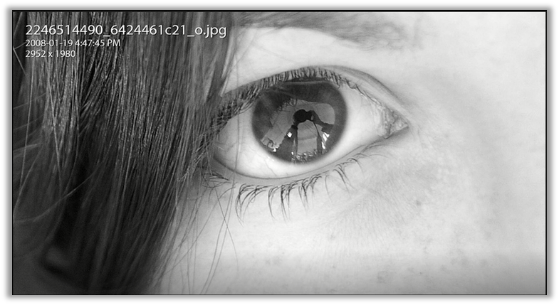
So it's kind of neat. So I just wanted to quickly point that out because an image is there to tell a story, an image is there to create that emotion, and I like this emotion of curiosity. I like what she did by creating and making this into a grayscale. But I also want to make a few adjustments to give it a little more warmth to make it a little more inviting to create my own story around this image. So that is where I'm going into this Split Toning panel.

I'm going to adjust the hue and saturation for both the highlights and also the shadows. This is what the Split Toning works on. It works on a band of colors within the highlights and also within the shadows. To show you what I mean. Let me adjust the saturation slider for the highlights. You will notice that the hue is a reddish color. What I'm doing is I'm adding one hue to the entire tonal range of this image. So it makes this kind of an orange-red type of look.

It is one kind of effect, and it's a really neat effect. This is one way to add a sepia tone or even a different color tone to your image. As I adjust the hue, it will be applied to the highlights. I'm going to make the image a little bit warm. So I want it within the yellow band, just to give that invitation of warmth and color. Then I will adjust the highlights, and I'm going to bump it up to around 37. Let's now work with the shadows. This time, I'm also going to adjust the saturation. We are going to make sure that it's the same as the highlights. Now the shadows, the hue is still within that red zone. But I want to make the image cool. So let's just move it and bump it up. It's a very, very interesting effect. You can see the highlights are within the warm yellow band, yet the shadows are cool.

So there is a nice contrast within this image. It is so lovely that it makes me want to understand the story and maybe make a few more associations and work. So I think this is a lot of fun, especially when you can work within this creative process.
One final adjustment that you can make between the highlights and the shadows is the balance. It entails how many of the highlights you want to show and how many of the shadows you want to show? And where do you want that emphasis? So once you have made these adjustments and you like them, let's work with the bounce slider. If we move it to the right, we are tending to exaggerate the highlights in the image. So you will notice that it is much warmer at the expense of all of the shadows. And if we move it to the left, we're emphasizing more of the shadows in the hues at work within the shadows and applied to this tonal range. So let's leave it at -30 to emphasize the shadows a little bit more. I want the blue look that makes this image just stand out a little bit more. This is what the image looks like after all of my adjustments.

And this is what the image looked like before.

Personally, this is maybe a little bit more fun. But once again, this is a subjective experience. And it's an experience that I invite you to try out for yourself.
The second example I wanted to give you a color photo of this young lady below.

Split toning is not for grayscale images though you can work with them. I also like to work with them within the color images because they give a nice look. I'm going to do the same thing that I did in the previous image. I am just going to bump up the saturation to about 33 for both highlights and shadows. Now, both the highlights and the shadows are in the red hue. But I want to warm up in the highlights and cool down in the shadows. So it gives a nice contrast between warmth and coolness, and it invites curiosity. This is just a very simple adjustment that you can make. So I think this is about the number of adjustments that I'm going to make for this image. This is the after view.

And this is the before.

Now, this is another view of the before and after views.

I want to let you know that each of these images is entirely subjective, and it's really about that emotion and the impact that you want to have on the viewer.
So I hope this section has helped you understand how to use Split Toning to add some sort of hue across the entire tonal range to the highlights and the shadows and adjust the balance. If you do have any questions, please don't hesitate to reach out. I am here as a source of support for your continued learning.
Full Course and Free Book
-

Adobe Photoshop Lightroom Classic
Course5.0 average rating (1 review)Are you a professional an amateur or an aspiring photographer or a digital artist? Impress by creating breathtaking photos with Photoshop Lightroom Classic CC. Learn hands-on techniques from one of the best photo editors there is.
Purchase$1 / month
-

Adobe Photoshop Lightroom Classic Book
CourseAre you a professional an amateur or an aspiring photographer or a digital artist? Impress by creating breathtaking photos with Photoshop Lightroom Classic CC. Learn hands-on techniques from one of the best photo editors there is.
Free